Label Row Card & Tile Components
Optional Row Card Headline, Lorem Ipsum

Title of content or product, up to 71 characters, lorem ipsum dolor sit
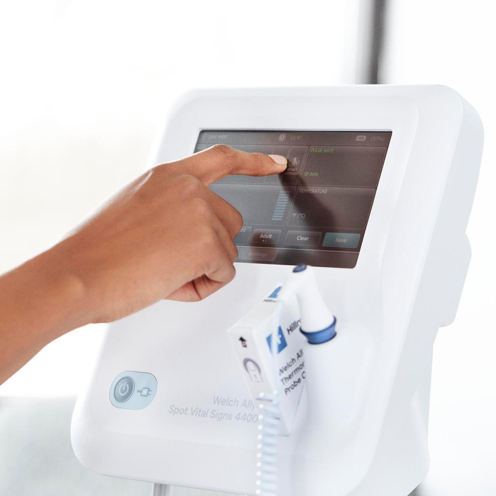
Row card description, up to 200 characters, hyperlinks not supported. Lorem ipsum dolor sit amet, consectetur adipiscing elit, sed do eiusmod tempor incididunt ut labore.

Title of content or product, up to 71 characters, lorem ipsum dolor sit
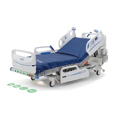
Row card description, up to 200 characters, hyperlinks not supported. Lorem ipsum dolor sit amet, consectetur adipiscing elit, sed do eiusmod tempor incididunt ut labore.

Title of content or product, up to 71 characters, lorem ipsum dolor sit
Row card description, up to 200 characters, hyperlinks not supported. Lorem ipsum dolor sit amet, consectetur adipiscing elit, sed do eiusmod tempor incididunt ut labore.
Label Row Card (3 Card) Component |
Shown Above in "Card with CTA" Variation |
| Authors must use caution when using anchor links in this component. This component does not support hyperlinks within the description fields. This component is not guaranteed to work when nested within others such as tabs, accorians, or dynamic column controls. |
Optional Row Card Headline, Lorem Ipsum

Title of content or product, up to 71 characters, lorem ipsum
Row card description, up to 200 characters, hyperlinks not supported. Lorem ipsum dolor sit amet, consectetur adipiscing elit, sed do eiusmod tempor incididunt ut labore.

Title of content or product, up to 71 characters, lorem ipsum
Row card description, up to 200 characters, hyperlinks not supported. Lorem ipsum dolor sit amet, consectetur adipiscing elit, sed do eiusmod tempor incididunt ut labore.

Title of content or product, up to 71 characters, lorem ipsum
Row card description, up to 200 characters, hyperlinks not supported.
Lorem ipsum dolor sit amet, consectetur adipiscing elit, sed do eiusmod
tempor incididunt ut labore.

Title of content or product, up to 71 characters, lorem ipsum
Row card description, up to 200 characters, hyperlinks not supported.
Lorem ipsum dolor sit amet, consectetur adipiscing elit, sed do eiusmod
tempor incididunt ut labore.
Label Row Card (3 Card) Component |
Shown Above in "Small Card Title + Description" Variation |
| Authors must use caution when using anchor links in this component. This component does not support hyperlinks within the description fields. This component is not guaranteed to work when nested within others such as tabs, accorians, or dynamic column controls. |
Label and Row Card Component |
Shown Above in "Home Page Tile" Variation |
| Authors must use caution when using anchor links in this component. This component does not support hyperlinks within the description fields. This component is not guaranteed to work when nested within others such as tabs, accorians, or dynamic column controls. |
Label and Row Card Component |
Shown Above in "Article Tile" and "Background Image" Variation |
| Authors must use caution when using anchor links in this component. This component is not guaranteed to work when nested within others such as tabs, accorians, or dynamic column controls. |
Optional Row Card Headline, Lorem Ipsum
Label and Row Card Component |
Shown Above in "Article Tile" and "Background Color" Variation (#142063) |
| Authors must use caution when using anchor links in this component. This component is not guaranteed to work when nested within others such as tabs, accorians, or dynamic column controls. |
Optional Row Card Headline, Lorem Ipsum
Label and Row Card Component |
Shown Above in "Card Layout" and "Background Image" Variation |
| Authors must use caution when using anchor links in this component. This component is not guaranteed to work when nested within others such as tabs, accorians, or dynamic column controls. |
Optional Row Card Headline, Lorem Ipsum
Label and Row Card Component |
Shown Above in "Card Layout" and "Background Color" Variation (#142063) |
| Authors must use caution when using anchor links in this component. This component is not guaranteed to work when nested within others such as tabs, accorians, or dynamic column controls. |
Optional Row Card Headline, Lorem Ipsum

Up to 16 Characters
Up to 93 characters, lorem ipsum dolor sit amet, consectetur adipiscing elit, sed do eiusmod.

Up to 16 Characters
Up to 93 characters, lorem ipsum dolor sit amet, consectetur adipiscing elit, sed do eiusmod.

Up to 16 Characters
Up to 93 characters, lorem ipsum dolor sit amet, consectetur adipiscing elit, sed do eiusmod.

Up to 16 Characters
Up to 93 characters, lorem ipsum dolor sit amet, consectetur adipiscing elit, sed do eiusmod.
Label and Row Card Component |
Shown Above in "Get Started Tile" Variation |
| Authors must follow stated character restrictions and use caution when using anchor links in this component. This component is not guaranteed to work when nested within others such as tabs, accorians, or dynamic column controls. |
Category Tile Component |
Shown Above in "Category Carousel" Variation |
| Authors must follow stated character restrictions and use caution when using anchor links in this component. This component is not guaranteed to work when nested within others such as tabs, accorians, or dynamic column controls. |
Up to 25 Characters
Description text up to 150 characters. Lorem ipsum dolor sit amet, consectetur adipiscing elit, sed do eiusmod tempor incididunt ut labore et dolore.
OPTIONAL BUTTONText and Promo Card Component |
|
| This component can only display information from existing Product Detail Pages ("PDPs"). Where you see products listed, authors cannot add custom content and can only select PDPs. Authors must follow stated character restrictions. This component is not guaranteed to work when nested within others such as tabs, accorians, or dynamic column controls. |


